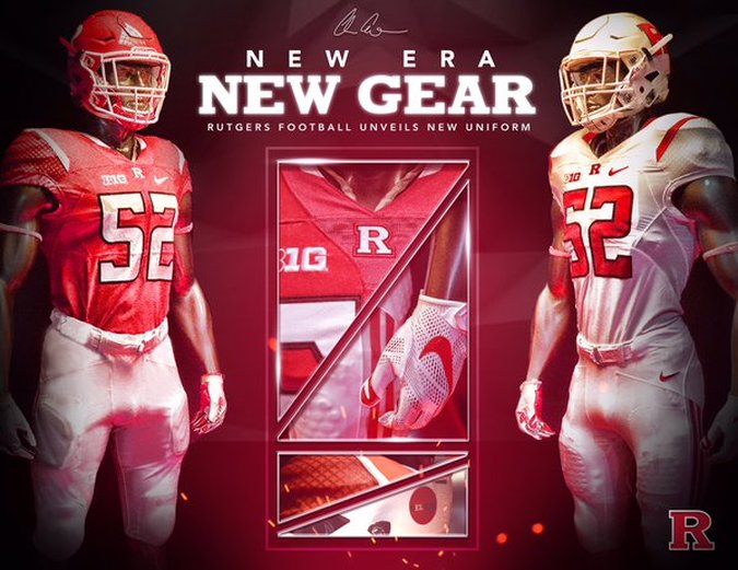
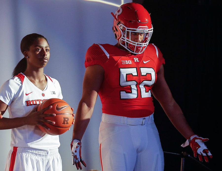
I'll be the first person to admit that I am biased. Chris Ash could have trotted out a bunch of players in red pinnies with taped on numbers and I would have been on both knees bowing in awe of his originality. That's just where I am as a Rutgers supporter. Kyle Flood broke me down as a fan. He brought me to the lowest of lows. Chris Ash has scooped me up out of my own self pity and carried me to towards the light. I really have no choice but to admire every decision that he makes with the Rutgers football program since we are in the wake of his footprints in the sand. I am just along for the ride, and - despite not seeing a snap of meaningful football - it's been a fairly encouraging one so far. These new uniforms - that bring a traditional feel with a modern look - are just another step in the right direction. I won't lie and say and I didn't enjoy Rutgers few seasons as the poor man's Oregon of the East. It was cool having a new color combination to look forward to almost every week. The fact that you could barely make out the silver numbers certainly took it's toll on the waning eyesight of the older generations of Rutgers fans, but they were still a welcomed change when they were first introduced. I won't say that change wore out it's welcome, but the incorporation of the throwback uniforms last last year certainly opened my eyes to how the Scarlet Knights were - well - no longer wearing scarlet. Considering how much work had to be done with this team I was certainly surprised that jerseys made their way on to the agenda, but now that I have seen the final product I am glad they did. The shoulder stripes, armored sleeves, and sharp numbers add a new twist to an old look that embraces the bold simplicity that once took the field in Piscataway - and more importantly - has staying power.
0 Comments
Leave a Reply. |
Categories
All
Archives
January 2020
|


 RSS Feed
