|
Is this what being outraged feels like? Is this pit in the bottom of my stomach and the instantaneous sick feeling what everyone has been clamoring about all these years? I got to say, I'm starting to understand how upset people get while discussing social issues if this involuntary nausea is what they have to deal with every time they find themselves offended.
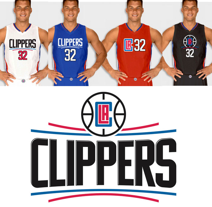
So Steve Ballmer...A+ business man. F- fashion designer. Not to say anything that we didn't already know, but I don't think he graduated with a degree in Visual Arts. This is the problem with billionaires. There is no one to tell them no. It's like being a big time college athlete. All you have to do is put your name on the paper and hand it in and your going to pass. All Ballmer has to do is give his stamp of approval and the Clippers have the most putrid jerseys in sports history. No questions asked. No second opinion. No social awareness necessary. Never mind the fact that everyone outside of the organization has been voicing their displeasure with the logo since it was correctly rumored a few months ago. What would a bunch of rational, down to earth, middle class (relatively speaking, it is Los Angeles we are talking about) sports fans know about style? I legit think Ballmer just told someone to create something that is the exact opposite of him. Like he walked in and said "I'm an old, dorky white guy that pulls his pants up to his belly button and wears white tube socks, what would people not expect me to draw up?". The only thing that is more surprising than how ugly those uniforms are is the fact that they got Blake Griffin to smile during the pictures. I think I would be more prone to smiling at a funeral than to smile with that ungodly, sacrilegious excuse for a professional sports uniform on. I actually like the black one the best out of all of them and even that fucking thing looks like the love child of the XFL and the NBA. I don't hate the fact that Ballmer rebranded. It actually makes a lot of sense. Despite how classic looking the newly obsolete script across the crest of the Clippers jerseys was, it was also far too similar to that of the Lakers. This Clippers team isn't your father's Clippers. They deserve to stand on their won. They deserve to arise from the shadows of the Lakers storied past. However, churning out a mockery of a logo was not the way to go about doing so. I know the decision has been made and the damage has been done, but these jerseys are so awful it's only right that I bitch and moan about them until the season starts and it actually becomes 'real'. Let's hope that whole 'look good, feel good, play good' thing doesn't hold true. I suppose two out of three ain't bad.
1 Comment
Aynika Asante
6/24/2015 11:39:22 am
These jerseys are hideous! They look bad on EVERYBODY! And every SKIN TONE!! With all the money the Clippers made this year, are they trying to tell me they couldn’t get a marketing team together to get this right?! I mean really?! Even the 76ers' new uniforms look better!
Reply
Leave a Reply. |
Categories
All
Archives
January 2020
|

 RSS Feed
